Industry
Document intelligence
Product
Docsumo
Docsumo - Taking new user's adoption to >90%
View from a desktop or laptop
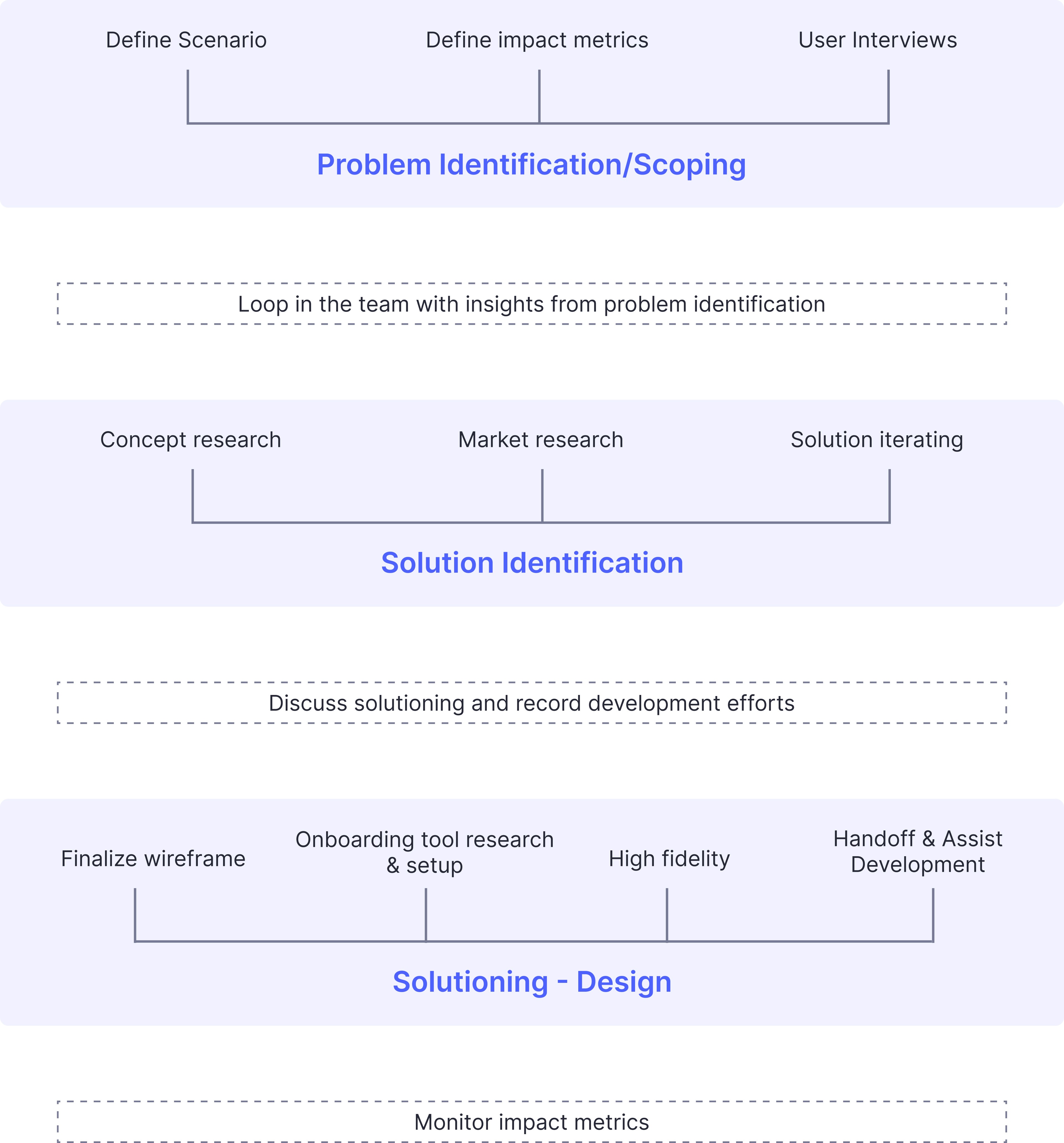
This case study will highlight the ideal process I follow in designing features and so this will be a longer read.
TLDR? Here's my process overview
Context
About Docsumo
Docsumo is an Intelligent Document Processing (IDP) application designed to extract data from structured and unstructured documents. While the product was powerful, it was also difficult and complicated for users to navigate, resulting in low self-onboarding rates.
The Challenge
One of the primary challenges was high user churn, largely due to a lack of clear direction for users after signing up and landing on the platform. Without a guided process or intuitive experience, users often disengaged before fully adopting the product.
The Goal
To address this, we set a clear objective: make Docsumo more intuitive and enable users to onboard and set up the product independently. This required a comprehensive approach to improving the user journey, starting from the moment they signed up.
Key Strategies and Solutions
Identified pain points in the user journey, particularly post-signup.
Designed a more intuitive onboarding flow to guide users step-by-step.
Enhanced the platform's usability to ensure users could easily set up and start using Docsumo without external support.
Impact and Results
The changes implemented had a significant impact on user engagement and retention. Key metrics include:
5x Increase in User Retention: More users remained engaged with the product after signing up.
Additional metrics that highlight the improvements in onboarding and overall user satisfaction were tracked to measure success.
Product Roadmap and Problem Identification
To understand why we took up retention as a problem to solve in the first place, some context about the product roadmap and the problem identification process is required
Objective
To make the product self-serve for high intent users that contribute to under $20k ARR.
Problem identification - Mapping the existing custom onboarding journey
Currently, 100% of Docsumo's existing customers are onboarded by the customer success team.
No customer has set up the account by themselves and integrated Docsumo to their workflow.
The obvious reason for this is the lack of a self checkout page and a defined pricing plan. While this is a part of the problem, this wasn't the only problem.
Only 15% of the users uploaded a document and reached the review screen.
These are the problems we were already aware of, but to identify all the friction points for the user on their self serve journey, we had to understand all the places where the customer success team is supporting the users to set up their account. So I created a custom user onboarding journey we follow by interviewing the customer success team.
Problem First Sessions (PFS) and Bucketing the problems
After identifying all the areas where Docsumo's customer success and engineering team is helping the users set up their account, I made a list of these problems and defined the scale of each problem. The friction points were:
Uploading the documents and landing on the review screen
Lack of knowledge of how to use the review screen
Wanting to sign NDA before uploading more documents
Customize the fields according to user's needs
Uploading 10 or more documents and training the model
Customize export format
Setup custom workflow (Import & Export)
Self checkout
A Problem First Session (PFS) was conducted with all the stakeholders including the founders to get everyone's alignment on this project.
Now, the problems were grouped in a way that makes execution easier. The problems were split in three ways:
Onboarding - Until uploading and processing the first document.
Adoption - Uploading more documents, improving the model, customize export, setup workflow.
Pricing and billing - Self checkout.
Locking the roadmap
Once the roadmap was finalized for the next 3 quarters, we locked it and and picked up the first piece of the problem - Onboarding.
Phase 1 - User onboarding
Now let's get to the actual case study - retaining the users that land on the product and giving them the Aha! moment.
Objective
Increase the number of users reaching the review screen after signup.
Defining current metrics
While beginning the project, the number of people landing on the review screen after signing up on Docsumo stood at ~15%. The review screen is the single most important screen on the platform where the user get's the actual value (aha moment). This was an alarmingly low number and I needed to understand the reasons why the number is low. Apart from this, a few other metrics were also tracked - Active time spent on the product (3.5 min) & users returning for the second session (9%).
Defining impact metrics
The same three metrics were taken as impact metrics:
North star - Increase the number of people landing on the review screen after uploading their document.
L1 metrics - Active time spent, Second login.
Problem Discovery
Challenge:
Lack of ideal personas to interview. We were able to arrange only two actual customers to give user interviews, users who signed up and were in the free plan did not revert to our emails for user interviews even though we offered them amazon gift cards. But since this was user onboarding, anyone who hasn't used Docsumo would also be eligible for the interview. So we interviewed 6 of our friends to collect insights on where the users are finding it difficult to use Docsumo.
Insights - User interview & screen recording
Right after landing on the product, invoice document type is already enabled. For users that aren't interested in invoice, they're lost and they don't know what to do next.
If the user wants to add a different document type like Bank Statements, he has to navigate to APIs and Services page and search for bank statements, and he has to enable it.
Even after doing this, there's no feedback or a direction that lets the user know what to do next. Now the user has to stumble upon the document type screen again and notice the newly created bank statement document type.
Users are clear about the next step which is uploading documents. The CTA is clear on the document type card so they're clicking on the upload button and uploading documents.
The upload modal on the bottom right is getting dead clicks while and after the document is uploaded.
While the document is being processed, users are rage clicking on the document name.
Processing time is very long and users are dropping off during this time.
Users don't understand how to use the review screen, takes a couple minutes to understand how it works.
Users are absolutely clueless on extracting tables if automatic extractions isn't perfect.
After the users are done verifying, they aren't aware that they need to now click on the approve button.
Insights - Customer success interviews
We have lost a couple customers to competitors due to complex interface
Invoices and bank statements are the most popular document types our users want to extract
If extraction fails, it is difficult to convert those customers because they've had a bad first impression.
Our sample documents also process. There is no reason why users should wait while the sample document is being processed
We also show low confidence signs for sample document. This is also not an initial good impression
The tutorial videos in the review screen are outdated
Stack ranking and filtering out the problems
A lot of problems were identified, but we didn't necessarily have to find a solution to all these problems. Based on some hypothesis we rated each problem against the impact and filtered them down.
The problems identified were grouped together into these categories:
Lack of direction after landing in the product
Terms used are too technical for a normal user to understand
Processing time of a document is too high
Lack of education on how to use the review screen
After the problem discovery phase was done, we had a call with the whole product team (Other PMs, frontend, backend) to share the existing problems with our product. We find that showing the problems and solutions and keeping the team in loop of the process makes them feel included and gives them context on why they're working on a certain feature and what impact it is going to create.
Solution identification
Before jumping to solutioning each problem, I explored the market with an open mind and observed the onboarding of the popular web apps, best practices for onboarding and some data that was available that supported each approach.
Concept research
This is the phase of researching onboarding as a process and understanding the best practices of onboarding. My findings were:
No onboarding is the best onboarding
Learn by doing is better than taking the user on an interactive walkthrough or a walkthrough video.
Progressive disclosure is always better. A new user shouldn't be bombarded with a huge list of things to do upfront.
Successful onboardings are always customized. If you're getting information from the user, use it to customize their experience when they land inside the product.
Contextual action nudges are the best way to teach the user to do something. This is preferred as opposed to a dedicated user guide page that the user should follow to learn about the product.
Make the signup frictionless. Take the user to the value as soon as possible
Minimize the number of steps - The optimal number of steps to educate the user about a certain feature is 3. Tours less than 3 steps have lower completion rate as do tours higher than 3 steps.
Market research
This is the phase of looking at the different onboarding practices top products in the industry have. I went through the onboarding processes of 22 web apps and recorded the onboarding approach they take.
There were only three types of onboarding approaches, based on that all the 19 web apps were grouped into.


Wireframe iterations
Now based on the above data gathered, I started solutioning for the problem. I created wireframe iterations for different types of solutions and compared the pros and cons of different approaches.
Solutioning
Onboarding tool research
Once the wireframes are finalized, the implementation phase begins. The first thing I needed to do here was to identify which onboarding tool to use to complete the solutioning. So I went to the market and looked at the tools and made a comparison.


Appcues and Chameleon were shortlisted, but we ultimately decided to go with chameleon as it offered more UI customization than appcues.
Step 1 - Signup
Existing problems
There were 5 signup steps which asked a bunch of questions to the user. There was a 5% of drop off shared within these steps.
Now these questions were not used to customize the user's experience in any way. So there was no reward to the user for completing these steps
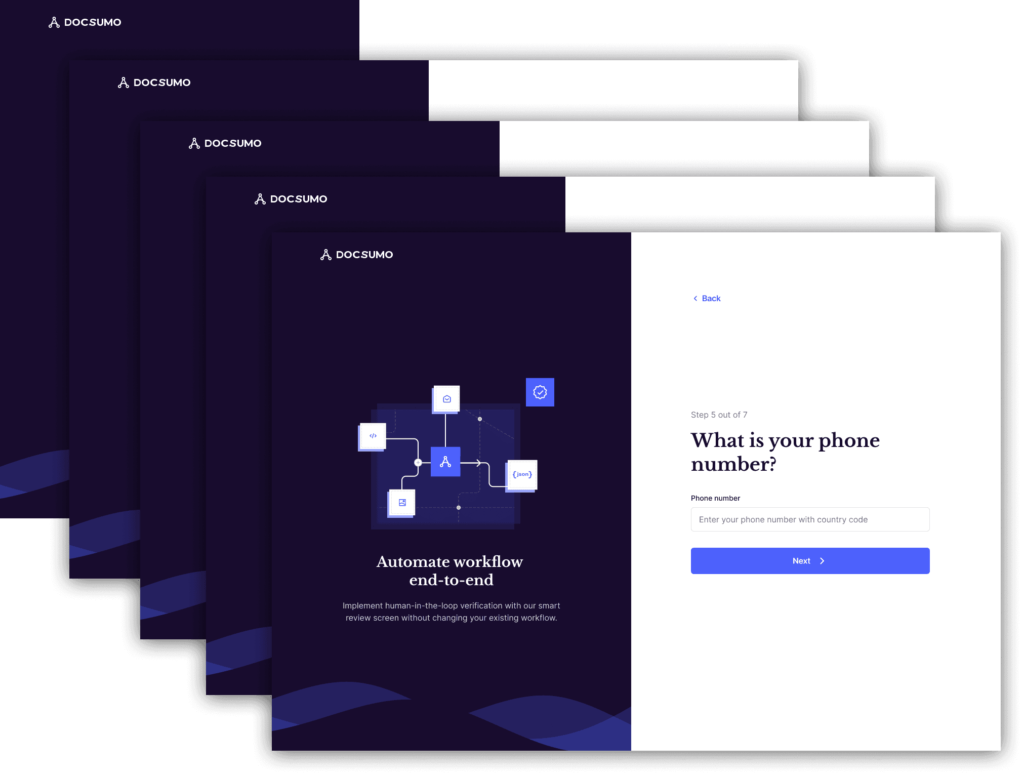
Solution - 3 step processes have the most completion rate
I had a call with the sales head, discussed if every data point was required intending to cut down the things that weren't. But all of the data points collected were being used to evaluate the lead.
So I took all the data points and shared them between three steps.
Impact - The drop off during the signup stages went from 5% to 0%

Step 2 - Upload a document
Existing problems
The percentage of people dropping off without creating a new document type and uploading at least one document was ~50%. This is a very big number.
Additionally ~30% of the people dropped off because of high loading times of the documents
When the user lands inside the product after signing up, the invoice document type is already created by default. But not all users signed up for extracting invoices. These users try to create a new document type but fail because of the confusing placement and text used.
There is more drop off because of the lack of feedback even after a new document type is created. To understand the problem in detail please watch the GIF.
Solution - Learn by doing
Firstly, the "APIs and services" term was removed in all places in the product and was replaced with "Document type"
When the user lands in the app, no document type will be enabled by default and the user will be presented with an empty state where the only action to take is to add a new document type.
To add a document type, a CTA button was added on the top right which would open a pop up listing all the document types available.
Personalization - Since we're getting the information of the document types the user is interested in on the signup survey itself, we list those document types on the top under "Preferred document types" on the pop up modal, so that the user doesn't have to scroll, search for it and select it.
After this, the user would have to upload at least one document or proceed with a sample document to create the document type
Reducing processing time was taken as a task by the engineering team and they were able to reduce it by 20%. Although the loading time even after improvement was still high.
The upload widget on bottom right was also improved, I added the processing tag and the review CTA near the name of the documents.
A tooltip was added through chameleon notifying the user that the processing time would take at least 30 seconds.
As soon as the document was ready for review, we initiated a chameleon tooltip again that'll ask the user to click the button.
Impact - To everyone's surprise, the drop off on this stage also went from ~80% to <2%
Step 3 - Educate how to review a document
The following are separate tasks that were completed to increase the adoption further.
Existing problems
The percentage of people dropping off without creating a new document type and uploading at least one document was ~50%. This is a very big number.
Additionally ~30% of the people dropped off because of high loading times of the documents
When the user lands inside the product after signing up, the invoice document type is already created by default. But not all users signed up for extracting invoices. These users try to create a new document type but fail because of the confusing placement and text used.
There is more drop off because of the lack of feedback even after a new document type is created. To understand the problem in detail please watch the GIF.
Solution - Non-disruptive, short (3 step), contextual action tours
While doing user interview I mapped the exact areas users found confusing and would've wanted some help. And for these specific places tours were crafted.
All the tours are contextual - They appear only if the user interacts with a certain element. For example: There is a tour to teach the user how to use the table grid. If the document type does not contain tables (Acord) the user would never get to see those tooltips and tours.
Impact - 66% of the users approved the document they uploaded. The adoption of the review screen couldn't directly be measured except time spent (which went up by 30%), but from Hotjar videos we found that the engagement with the review screen had improved.
Additional solution
This additional task was done after the deployment of onboarding to further promote the adoption of the product.
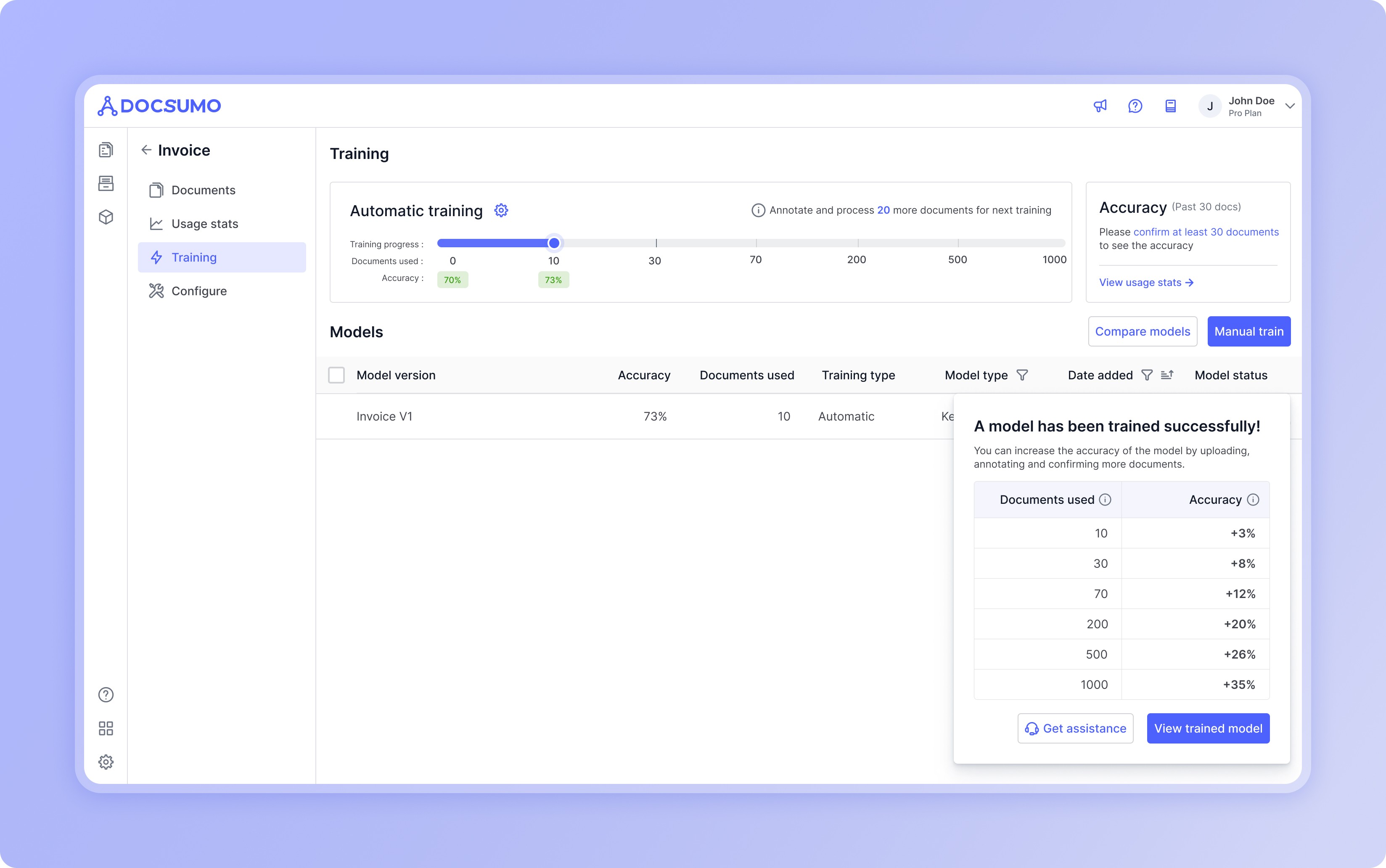
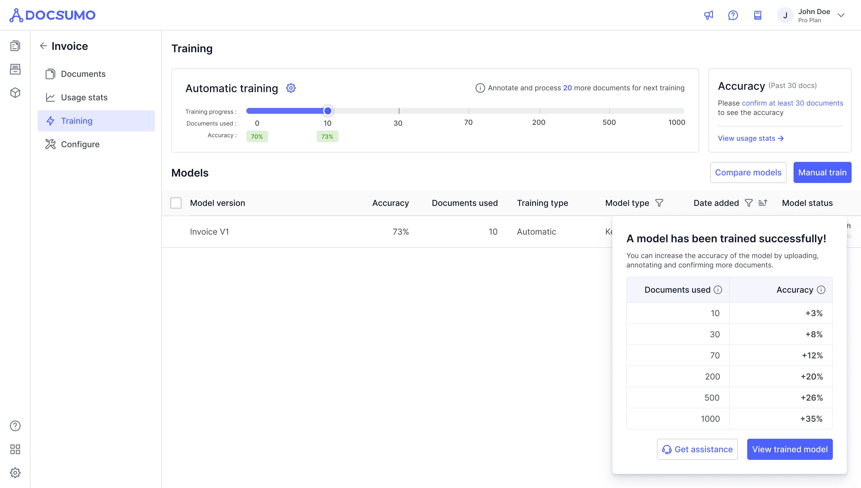
Automatic model training
Since each user might have custom document requirements, Docsumo's pre-trained models might not always get the job done. In these cases users have to manually train ML models to extract data from their custom documents.
But this was a huge friction since users don't understand the concept of ML, training etc.
So we created a feature where users only have to annotate the documents, and the ML models will automatically train within standard intervals.
This meant the users just have to keep using the product and the models will keep getting intelligent.

A few other supporting features like self checkout, customizing export and additional integrations were added to the product to promote adoption and self serve.
Thanks for reading this case study!
